Print Magazine Graphics
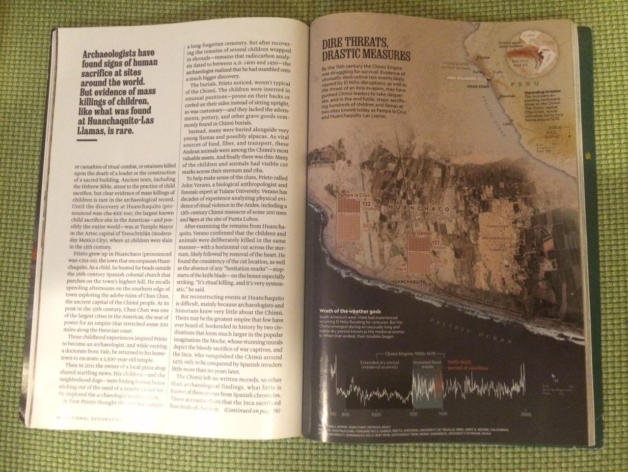
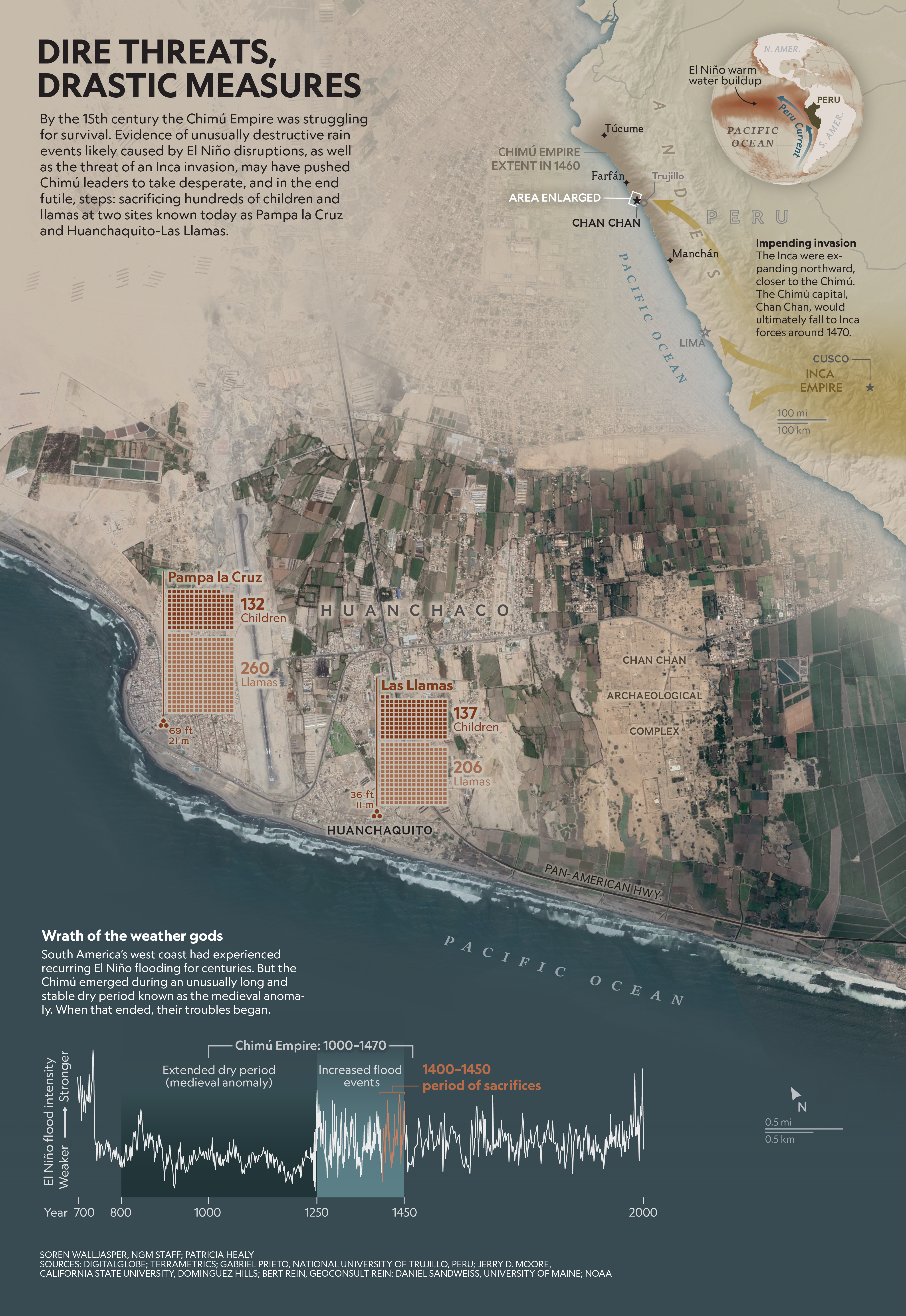
This combination map/graphic was made for a story in the February 2019 issue of National Geographic Magazine. The story's key locations and themes span geographic and temporal extents, so the challenge in designing this graphic was being able to combine them elegantly in the limited space provided in print. I decided that using aerial imagery as the background and layering other elements on top of it was the best way to integrate everything. Here is the full web version of the article.

